

Let's get physical: when brands become spaces
There's always a moment — the second you walk into a new space, whether it's a shop, a bar, a restaurant, or a stand — when the body has already made up its mind. It doesn't ask for information, it hasn't read the concept, it didn't sit through the presentation. It just looks around and decides, in a completely arbitrary and utterly final way, how things stand.
When a brand becomes a space, its language inevitably changes. It's no longer something to look at — it's something to move through, use, and inhabit. And the body, unlike the mind, is not particularly diplomatic. It has no interest in storytelling. It doesn't read concepts. It immediately knows if a chair is uncomfortable, if the light is tiring, if time stretches or contracts.
The memory a space leaves behind is neither sharp nor orderly. We don't remember exactly what it looked like — we remember how it made us feel.
"I could have stayed longer." "I couldn't wait to leave." "It was strange, but it worked."
Not very useful for a report. Essential for a brand. Physical memory is made of residual sensations. It surfaces later, once the experience is over. And it's far harder to design — and to control — than any visual system.
The point is not to bring into a space what already works on a screen. Covering walls in brand colors, lighting every surface with the logo, filling every corner with visuals consistent with the website — it's an understandable solution, but it's like translating a poem word for word. The result is correct, but completely lifeless.
A brand that becomes a space needs to do something more interesting: translate itself. Find a physical equivalent of its values, not a faithful copy of its visual identity. And that translation almost never comes through Pantone colors or the fonts in the brand manual. It comes through materials, proportions, the quality of light, the way people move. Through the things that rarely get talked about: sound, silence, echo, temperature, smell. You might forget the color of the walls, but you'll rarely forget if you were cold. Or if you had to shout to be heard.
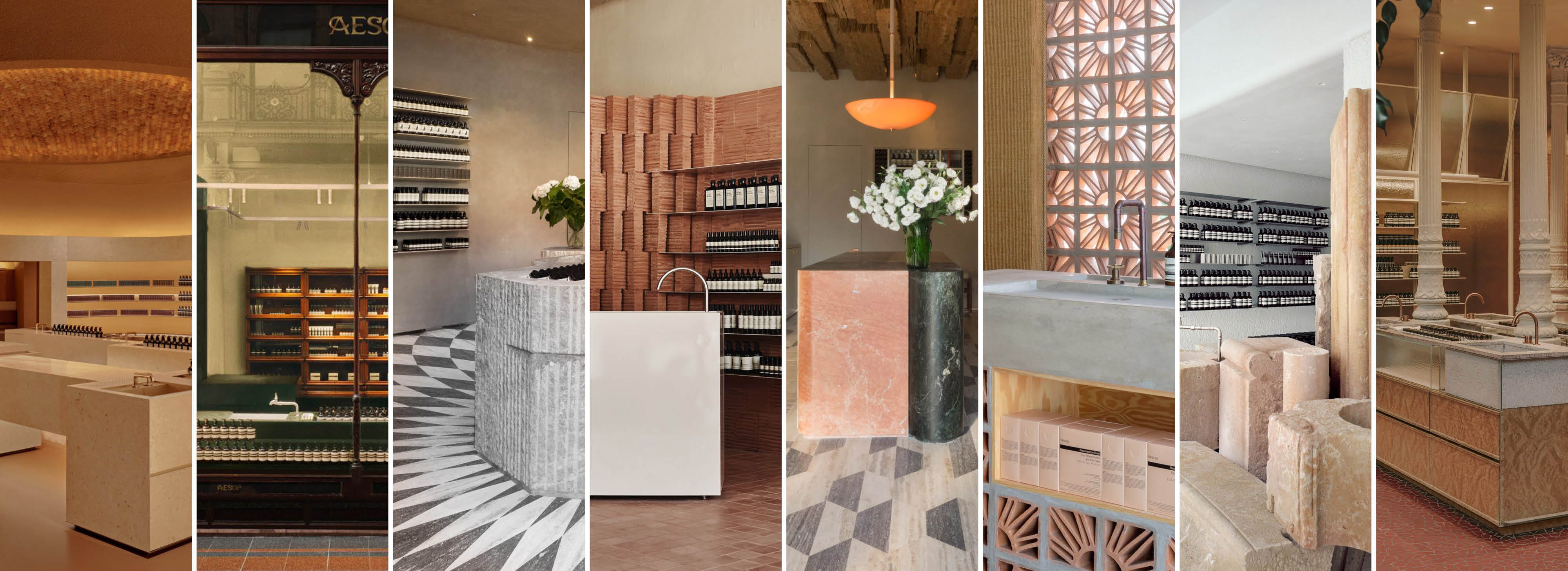
Take Aesop. Every store is designed by a different studio, with materials and styles that vary radically from city to city. There's no template to replicate, no imposed palette. And yet you walk into any Aesop anywhere in the world and recognize it immediately — not because the logo is everywhere, but because you sense something specific: a certain quality of attention, a slowness, a rigor in the details that is unmistakably theirs. The brand doesn't show itself. It's felt.
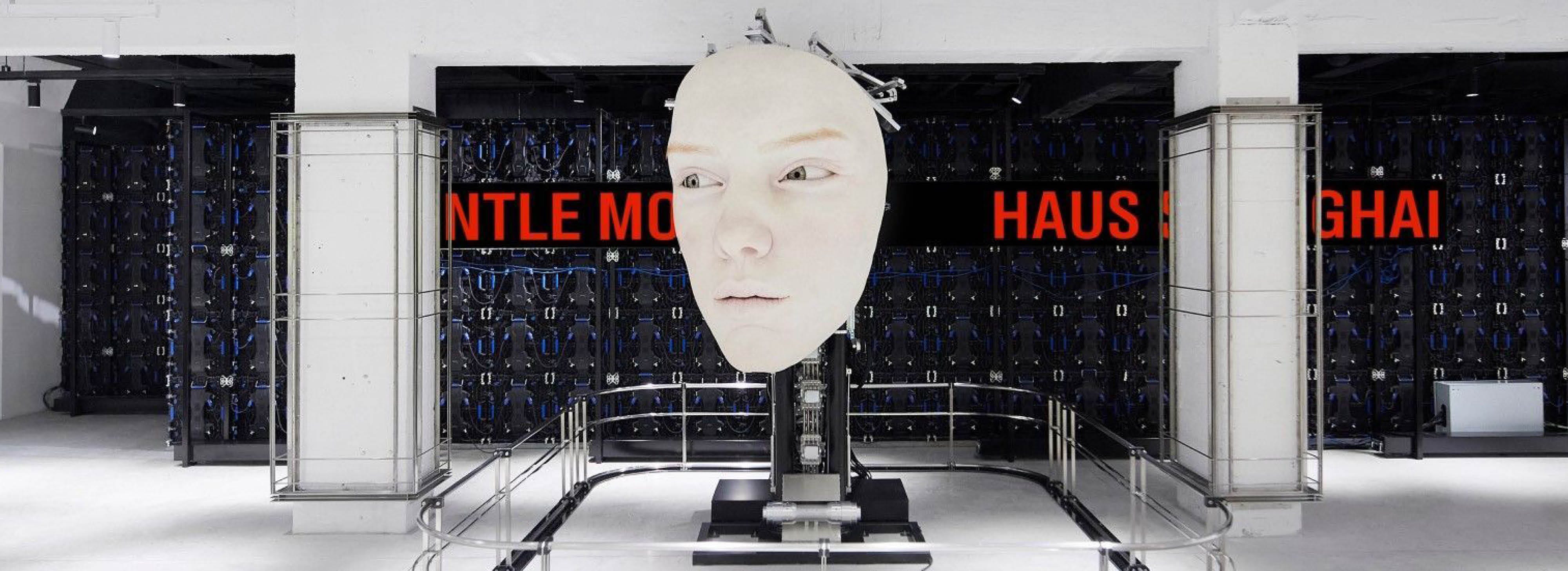
Gentle Monster takes this logic to the opposite extreme. Their stores look like art galleries or film sets where the glasses — the actual product — are almost beside the point. The spaces build an atmosphere that is immediately, unmistakably theirs, without signing every wall or repeating any visual system. All it takes is the route, the surprise, the sense of controlled disorientation.
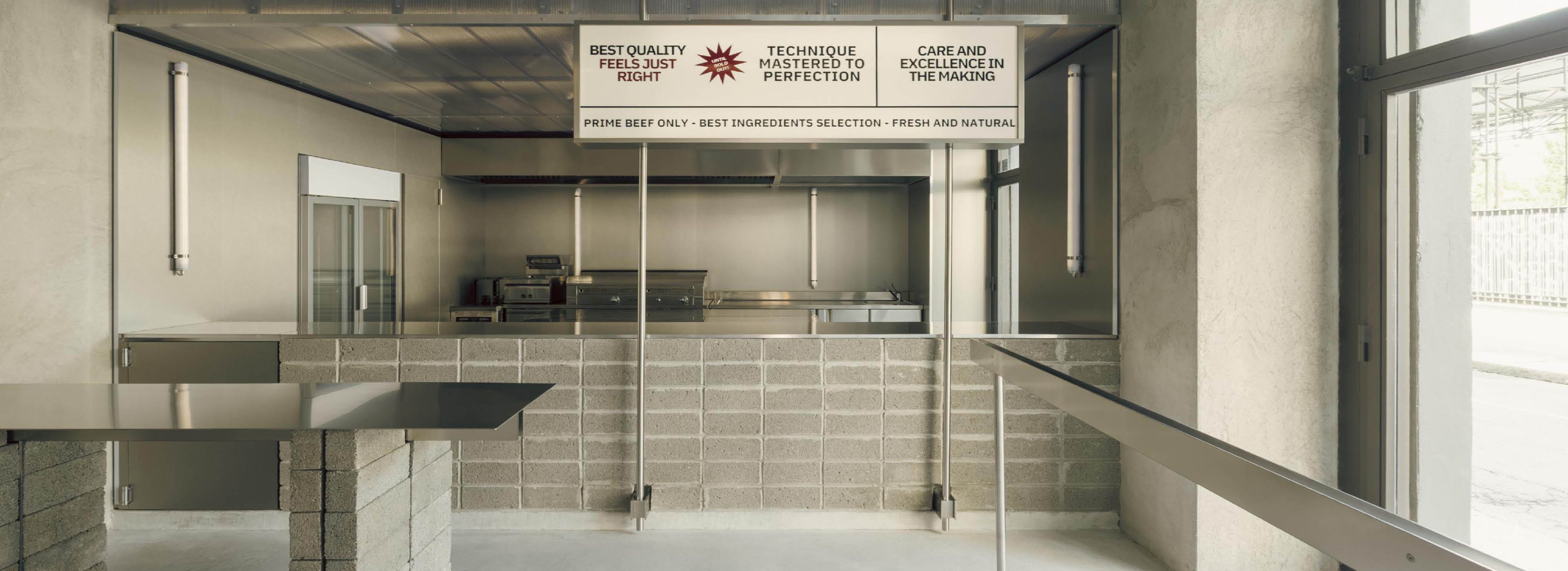
Then there’s a more ambivalent case. The Street Smash Burger store designed by Solum in Milan is cold, essential, almost austere: concrete, stainless steel, precise geometries. It’s not a space that invites you to linger — the surfaces are hard, the light doesn’t warm you, comfort is not a priority. And yet that austerity has its own coherence, and generates an experience you remember. Proof that a space doesn’t need to be welcoming to be effective.
This is the leap that not everyone manages to make. Because it requires trusting experience over immediate recognizability. Accepting that people don’t need to see a brand to feel it. That an unexpected material, an unusual proportion, a carefully designed light can communicate more than any well-placed logo.
Time, in this sense, is an underrated ally. How much does a space invite you to stay? How much does it push you to leave? The brands that leave a mark are often the ones that aren’t in a hurry — that allow for pauses, waiting, apparently unproductive moments. That treat the customer’s time as something to be respected, not filled.
When a brand goes physical, the boundaries of the project expand. It’s no longer just about what people see — it’s about how they move, how long they stay, what they remember the next day without quite knowing why.
Physical memory can’t be explained. It can’t be imposed. It doesn’t follow a perfect script.
It settles.
And in the end, the right question is not “is it recognizable?” but “does it leave a mark?” They’re different questions. The second is much harder to build — but it’s the one that actually counts.